VOCABULARY / ENTRY
Papercut
papercut
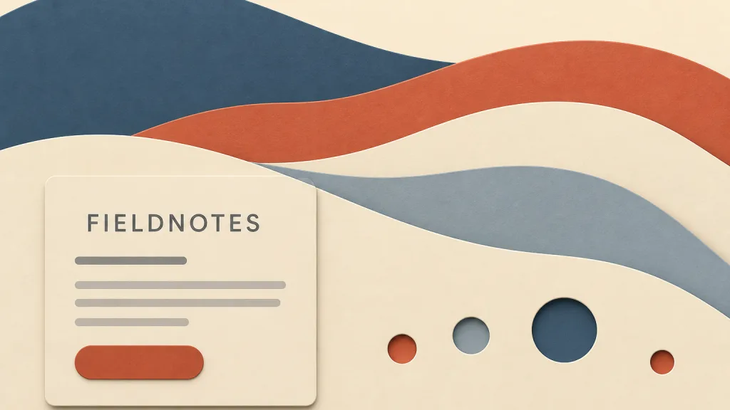
A graphic language that breaks a picture into several sheets of flat-colored paper stacked layer on layer and separated front to back by soft shadows: each layer has a clean, knife-cut edge, and shadows and cutouts reveal the layers beneath, giving shallow but legible depth. It is common in illustration, banners, and parallax motion.
Recognizing it
- The picture is built from three to six flat-colored layers, one color per layer
- Layer edges are clean curves or zigzags, like edges cut with a knife or scissors
- Short, soft shadows separate the layers, and cutouts let the lower colors show through
Concept boundary
This entry covers only the digital graphic language that imitates layered paper cutting in interfaces and brand imagery. It does not summarise papercutting as a craft and folk tradition — Chinese jianzhi, Japanese kirie, Swiss and German Scherenschnitte — with their techniques, motifs, and ritual roles, and it does not treat this style as a reproduction of those traditions. The test is the combination of flat-colored layers, knife-cut outlines, soft shadows between layers, and cutouts revealing what lies beneath — not "paper-like colors". It differs from collage, which joins fragments of different origin and keeps the seams visible, whereas papercut layers usually share one palette and one outline language. It also differs from skeuomorphism: it borrows the layering of paper, not a physical object that explains an interface function.
When to consider it
- The brand needs an illustration language that feels gentle and handmade yet stays tidy
- A banner, empty state, or onboarding screen needs shallow depth and a light parallax
- The content hierarchy maps onto a few front-to-back layers
When to be cautious
- Dense tables, forms, or dashboards, where layered shadows get confused with the real hierarchy of controls
- Setting text directly over areas where several layers of shadow overlap
- Borrowing specific motifs and auspicious symbols from a folk papercutting tradition with no connection to the content or context
Tradeoff
Flat layers with soft shadows create clear depth and a friendly handmade feel from very few colors. The cost is that every layer must be drawn and maintained separately, which makes redesigns hard once the layers multiply, and decorative layer shadows are easily confused with the interface's real interactive hierarchy.
Conditional rules · Editorial advice
Related entries
Collage joins fragments of different origin and keeps the seams and jumps in scale; papercut stacks layers drawn in one palette and one outline language, aiming at tidy depth rather than heterogeneous juxtaposition.
Each layer is itself flat color; papercut reintroduces shadow only between layers, so it can be read as flat design with a limited amount of depth added.
Shadows and cutouts between layers make it obvious which layer is in front; the figure-ground principle explains why that separation reads quickly.
The color behind the text changes from layer to layer, so the effective contrast is set by the least favorable layer.
Sources and what they support
The article describes papercutting as an art of paper designs that developed in many cultures, typically cut from a single sheet rather than assembled from several pieces as in collage, and lists traditions including Chinese jianzhi, Japanese kirie/kirigami, Swiss and German Scherenschnitte, and Slavic wycinanki, the last described as bright, multilayered work. This entry uses it to draw the craft-tradition side of its boundary; the guidance on the digital layered-paper style is editorial.
Retrieved: 2026-10-20The page records that Chinese paper-cut was inscribed on the Representative List of the Intangible Cultural Heritage of Humanity in 2009, explains that the paper can be cut or engraved with a chisel and left plain or colored, and describes its use to decorate interiors such as windows and in celebrations such as weddings and birthdays, as well as in prayers. This entry uses it to note that folk paper-cut carries ritual and social meaning, so borrowing its motifs in an interface calls for respect for context.
Retrieved: 2026-10-20 · Snapshot unconfirmedDefinitions reference these sources. Digital specimens, selection advice, relationships, and recipes are editorial work and have not been validated through user research.
Type extensions and implementation notes
This entry has no runnable specimen; the illustration is an editorial sketch, and its layered outlines are original abstract shapes that copy no traditional paper-cut motif. Before shipping, confirm that layer shadows are not confused with the hierarchy of interactive elements, and test contrast in text areas and behavior under reduced-motion settings.
{
  "tokens": {
    "surface": "#f4ecdc",
    "ink": "#2f3a45",
    "accent": "#c4653f",
    "radiusPx": 0,
    "shadow": "0 2px 6px rgba(47, 58, 69, 0.18)"
  },
  "tokenScope": "This sample recipe — cream paper ground, slate ink, terracotta accent, and one short soft shadow to suggest the gap between layers — shows one direction only. Real work must define a color and shadow strength for each layer and verify contrast wherever text sits."
}
Open the Agent JSON file for this entryThis file repeats every field of this entry verbatim and adds its sources, archive status, and editorial scope.