VOCABULARY / ENTRY
Ripple Effect
ripple-effect
A translucent circular wave that spreads outward from the touch point when a control is pressed, covering the control's surface and then fading; it is one concrete way Material Design expresses the pressed state, and belongs to the translucent "state layer" laid over a control.
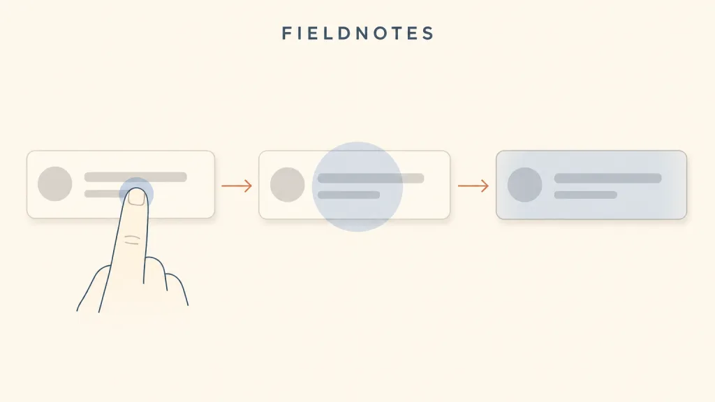
Recognizing it
- The wave spreads outward with the finger or pointer's press position as its centre, rather than the whole surface changing colour at once
- The wave is a translucent overlay, so the label and icon beneath stay readable
- On release or moving away the wave fades and the control returns to its resting look
Concept boundary
A ripple is one way of implementing pressed-state feedback, not the pressed state itself: the pressed state answers "was my press received?", and the ripple answers it with a wave spreading from the touch point, where a colour change, an inset, or a shadow could answer the same question. It carries a distinct Material lineage and looks borrowed inside other design languages; nor is it a loading indicator or a result — a finished wave does not mean the action is done. Unlike hover and focus states, in Material's implementation the spreading animation belongs to the moment of pressing alone, while hover and focus show only a static state layer.
When to consider it
- The product uses or sits close to the Material design language, and users already know this press feedback
- Large tappable areas such as list rows and cards need to show where exactly the press landed
- A touch interface has no hover state and needs a press confirmation more visible than a plain colour change
When to be cautious
- The product's visual language has nothing to do with Material, so a borrowed ripple looks like part of another system
- The ripple is the only feedback, and nothing remains once it is switched off under a reduced-motion preference
- The page navigates or refreshes before the wave has played, so the user sees only a passing flicker
Tradeoff
A ripple says both where the press landed and that it landed, which is easier to notice on large touch targets than a colour change alone; the cost is its strong Material identity and its reliance on animation — when the animation is switched off or drops frames on low-end devices, it either vanishes or feels sluggish.
Conditional rules · Editorial advice
Related entries
The ripple is one concrete implementation of pressed-state feedback in the Material language; the pressed state's requirements — immediate, distinguishable, acting only on release — bind the ripple as well, and the ripple is only one possible answer.
The ripple confirms the input was received and the transition explains how the interface changes; when they stack, let the ripple be seen before the transition starts.
The ripple confirms the press through the visual channel and haptic feedback through another; when the ripple is switched off under a reduced-motion preference, haptics and a static colour change can take over.
A ripple spreads only on press and cannot stand in for a persistently visible keyboard focus indicator; both must be present without obscuring each other.
Sources and what they support
The documentation of Material Design's official web component library defines ripples as state layers that communicate the status of a component or interactive element, a state layer being a semi-transparent covering on the element. It says ripples display on hover and press pointer interactions, and notes that ripples are visual components with no assistive technology requirements. This entry takes from it that the ripple is a visual implementation of press feedback, and that it cannot carry accessible state information.
Retrieved: 2026-10-20 · Snapshot unconfirmedThe API documentation calls Ripple a Material implementation of Indication that expresses different interactions by drawing ripple animations and state layers: it responds to a press by starting a new ripple animation, and to other interactions by showing a fixed state layer whose alpha varies with the interaction. This entry uses it to separate the ripple's spreading animation, which belongs to pressing, from the static state layer shown on hover and focus.
Retrieved: 2026-10-20 · Snapshot unconfirmedDefinitions reference these sources. Digital specimens, selection advice, relationships, and recipes are editorial work and have not been validated through user research.
Type extensions and implementation notes
This entry has no runnable specimen; the illustration is an editorial sketch that shows the wave spreading in frames and does not represent a verified implementation. Before shipping, confirm on a real touch device that the wave starts at the touch point and is distinguishable from hover and focus states, and recheck the static fallback with the system reduced-motion setting on.
{
  "states": [
    "rest",
    "pressed",
    "spreading",
    "fading"
  ],
  "a11y": [
    "The ripple is visual feedback only; the control's role, name, and state must still be expressed through accessible properties",
    "Under a reduced-motion preference the spreading animation is not played and a static state layer takes its place",
    "The ripple's translucent overlay must not lower the contrast between the label text and its background"
  ],
  "motion": "The wave begins spreading from the touch point on press, covers the control, and fades on release; under a reduced-motion preference the spread is omitted and only a static pressed state layer remains"
}
Open the Agent JSON file for this entryThis file repeats every field of this entry verbatim and adds its sources, archive status, and editorial scope.